We use cookies to make your experience better. To comply with the new e-Privacy directive, we need to ask for your consent to set the cookies. Learn more.
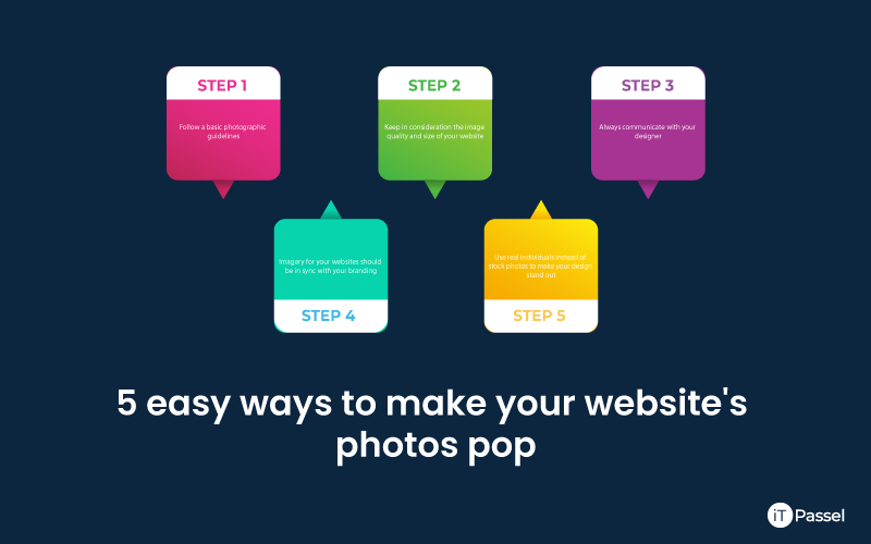
5 easy ways to make your website's photos pop

Images on your website can help you connect with and engage with your audience in a strong way. However, if used incorrectly, visuals may be damaging and undercut your message. Our brains detect images in just 13 milliseconds, according to MIT neuroscientists. Visuals are processed 60,000 times faster than words in the brain. These are compelling statistics that emphasize the necessity of using high-quality, appropriate pictures to convey your message. Here are some suggestions for making the most of your website photos while also supporting and enhancing your message.
List to make your website pop
- Keep in consideration the image quality and size of your website.
- Follow a few basic photographic guidelines.
- Imagery for your website should be in sync with your branding.
- Use real individuals instead of stock photos to make your design stand out.
- Always communicate with your designer.
Keep in consideration the image quality and size of your website.
Always utilize high-resolution photos. That implies a lot more than a photograph taken with a smartphone. Even though several smartphones these days produce reasonably good images, you can still do better. Use images that are at least as wide as your viewport for your side headers to avoid stretching an image to fit your viewport. Its quality may suffer as a result. Also, rather than portraits, use landscape photographs. It's possible that portrait photographs won't fit in your header section. What about the size of the image? The suggested screen resolution is 72dpi. In print, the resolution is 300dpi, which means the graphics are much larger. Check your image resolution if you have a huge image that was intended for printing to avoid delayed loading issues. In Photoshop, you can change the image resolution. However, keep in mind that the image's pixel size will shrink as well.
Follow a few basic photographic guidelines.
Lighting and composition are two crucial aspects of photography that may make or break a shot. It's crucial to have good lighting. Always ensure that the light in your shot is evenly distributed. This makes it easier for your users to see what you want them to see. Make sure the subject's face is visible in portraits and that no unwanted shadows obscure or creep behind them. If you're photographing a product, make sure it's sharp and well-balanced against the background.
The key to success is composition.
The Rule of Thirds is one of the most important rules to remember when capturing images. We enjoy images that have a sense of order to them. One of these methods entails dividing photos into thirds and placing the topic at or near one of the divisions. Take a look at the image below to see what I mean.
Bonus tip: Now that you've mastered the fundamentals, check out these advanced composition ideas.
On the web, the rule of thirds is particularly useful for cover pages. This is because an image is frequently accompanied by a headline and a call to action. Choose an image that offers the call to action plenty of exposure. The subject is positioned on the left side in this example to free up the right side for the call to action.
Quick tip: Text will always stand out better against a nicely blurred background.
Another example can be seen on Operator's website. The image is composed of a person on the right side, allowing the appropriate space on the left for the call to action, as shown below. You can be inventive and defy the rules on occasion. You can put your text and call to action in the middle of the screen, for example, but keep readability in mind at all times. This is done really well on the Kindeo website. Although the subjects are on the left, the image's composition allows for the headline and call to action to be in the center. Placing the tablet on the right also helps to balance the image.
Imagery for your website should be in sync with your branding.
Most brands, in addition to their logos, utilize a combination of imagery and artwork to effectively represent themselves. The brand's iconography becomes just as powerful as its colors and text. The imagery also aids in the development of a brand concept. The photograph with a brand's logo makes it easy to recognize it.
An example from Poker Stars follows:
The Poker Stars lineup clarifies things even more. The image's major colors are the same as those in the Poker Stars logo, which is the most significant component.
Use real individuals instead of stock photos to make your design stand out.
Websites that sell stock photographs can be really useful. The internet contains vast image collections, and search engines have progressed to the point that you can locate practically anything you're looking for. But keep in mind that you're not the only one who uses those images. Plus, when your company grows, you'll want to stand apart. A stock photo website can be your greatest alternative if you're short on time and money. Spend some time looking for photographs you like and build a list of them. But, after you've got them, talk to your designer. They might give you tips on how to modify those photos so they don't look like stock photos. However, spending money on personalized photographs is usually a fantastic idea. A photoshoot will take more time and money than purchasing a set of photographs from a stock source, but you can be certain that no one else will use the same images as you. You'll be one-of-a-kind.
Always communicate with your designer.
We're here to assist you! Please get in contact if you'd want some guidance on image composition and how to make your photos stand out on your website; we'd love to hear from you.


