We use cookies to make your experience better. To comply with the new e-Privacy directive, we need to ask for your consent to set the cookies. Learn more.
Why Mobile-First Design Strategy is Important for Our Web Project?
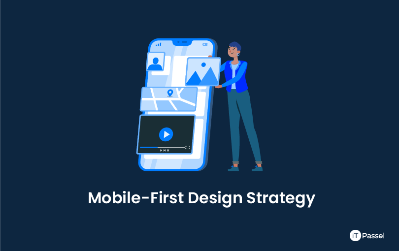
Anastasia explains why the mobile-first design strategy ensures outstanding outcomes in catering to mobile users' needs and how it boosts responsive design in the post. If you're thinking about using a mobile-first design strategy in your project, IT passel’s web design services can help.
According to the most recent global statistics, mobile accounts for 52.6 percent of all internet traffic, and some of IT passel's clients estimate that their mobile visitor share exceeds 55 percent. To put it another way, if you already have or plan to obtain a website, web portal, or web app, keep in mind that more than half of your visitors are seeing it on a mobile device.
7 Key Elements Of Mobile-First Web Design Strategy
- Why does a desktop-first strategy undermine the mobile experience?
- How mobile-first design aids in the creation of a good mobile experience?
- How does integrating a mobile-first strategy with responsive design assist you?
- Design that is focused and uncluttered
- UX that has been well planned
- Design method that is both faster and less expensive
- Choose the best place to begin your web project.
Why does a desktop-first strategy undermine the mobile experience?
When mobile devices are not taken into account from the beginning of the design process, the software is 'squeezed' into a mobile screen. This frequently means that some of the software's most important functions are lost on mobile simply because they don't fit.
IT passel discovered more severe faults with desktop-first design throughout its UI auditing process, which resulted in quick visitor bounce. One of these drawbacks is the hover function, which is simply not available on touchscreens. If your desktop website isn't mobile-friendly and the menu relies on cursor hovering, mobile users will be unable to navigate the site and will abandon it.
To put it another way, interacting with web information on a desktop device is vastly different than interacting with web content on a mobile device. So, if you want your desktop and mobile visitors to feel at ease enough to remain, register, and pay, you must adapt to their device-specific requirements.
How mobile-first design aids in the creation of a good mobile experience?
It takes a lot of painstaking work to make your online solution look and feel natural across devices. The mobile-first strategy aids in the organization of this activity and the production of tangible outcomes.
The main rationale behind the mobile-first design strategy is that producing content for mobile devices is far more challenging than designing content for desktop devices due to limited space and specialized interaction patterns. By developing the mobile UI first, you can create a high-quality mobile experience without being constrained by the limits of a finished desktop design.
The main benefit of a mobile-first strategy, in my opinion, is that it helps avoid 'graceful degradation,' which is when a full-screen UI is stripped of its elements in order to fit it on a mobile screen. Instead, the policy encourages 'progressive enhancement,' which entails releasing key capabilities for mobile devices before layering on more complex levels of functionality and content on larger screens.
How does integrating a mobile-first design strategy with responsive design assist you?
Although I've heard claims like "mobile-first is better than responsive design," they don't make much sense. Responsive design is a design methodology, whereas mobile-first design is about strategic strategy. So, rather than picking between a tool and a substance, make sure your source offers both.
In our experience at IT passel, there are three significant advantages of using a mobile-first strategy for responsive design:
Design that is focused and uncluttered
The first step is to assess the demands of the users and, using the information gathered, prioritize the aspects of the future online solution. Prioritization enables a clean, uncluttered design across all platforms. As a result, when developing the mobile version for the smallest screen, we only include top-priority material and place lower-priority parts on larger UIs with more free space for items.
Instead of simply having those desktop parts that managed to fit on the screen, the mobile UI responds to the consumers' basic demands in this way.
UX that has been well planned
Designing for mobile first forces us to think about all of the mobile UX intricacies right from the start. This prevents scenarios where mobile-incompatible content pieces or interaction patterns – such as small, non-tap-friendly click areas – are already present in a desktop-sized layout and must be readjusted or redesigned in a mobile version, requiring additional effort and money.
Design method that is both faster and less expensive
Mobile UI is designed for older browsers with more faults and errors when it comes to displaying responsive content. Getting these issues out of the way early on makes subsequent work go more smoothly, whereas a desktop-first design would only identify similar bugs, later on, forcing the development team to rewrite code for all larger screen variants as well. Choose the best place to begin your web project.
Mobile design can only be done correctly if it is factored in from the beginning. You may be confident in the results of your web project if you use a mobile-first design strategy that fits within your budget and timeline. If you'd want IT passel to assist you in putting this method into practice.
IT Passel, a well-known Website Development Company, for assistance with any part of your eCommerce website. There is no charge for a consultation.